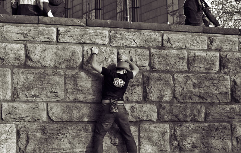
The Climber

Another one from the archives. I didn’t post this before as I wasn’t sure about it. Obvious criticisms would be that the composition is too centric, the perspective isn’t right and perhaps I should have framed it a bit differently, including the whole body of the climber for example. But having said that I like the way it looks in monochrome and the contrast. So here it is. Feel free to voice your criticism through email.
Leave a Reply